
Tabs Component
요구사항
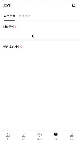
- 하단 시연 영상과 같이 탭을 클릭했을 때 선택된 요소로 인디케이터가 이동합니다. 즉, 동일한 형태와 애니메이션이 적용되어 있어야 해요.
- 선택된 Tab에 따라 알맞은 항목을 보여주어야 합니다. 그러기 위해서는 다른 컴포넌트와 Tab의
상태를 공유할 수 있어야 합니다.
Step1 - 상태를 공유할 수 있는 Provider 생성하기
트리에 걸쳐서 선택된 탭의 상태를 공유할 수 있도록 먼저 Provider를 생성합니다.
typescript
'use client'; import { createContext, useContext, useMemo, useState } from 'react'; type TabContextValue = { selectedTab: string; setSelectedTab: (value: string) => void; }; type TabProviderProps = { initialValue: string; }; const TabContext = createContext<TabContextValue | null>(null); export default function TabProvider({ children, initialValue }: PropsWithStrictChildren<TabProviderProps>) { const [selectedTab, setSelectedTab] = useState<string>(initialValue); const memoizedValue = useMemo( () => ({ selectedTab, setSelectedTab, }), [selectedTab] ); return <TabContext.Provider value={memoizedValue}>{children}</TabContext.Provider>; } export function useTabContext() { const tabContext = useContext(TabContext); if (!tabContext) throw new Error('부모 트리에서 TabContext를 사용해주세요.'); return { ...tabContext }; }
Step2 - Compound Pattern을 적용한 Tabs 구현하기
typescript
'use client'; import { motion } from 'framer-motion'; import { cn } from '@/utils'; import Spacing from '../Spacing'; import { useTabContext } from './TabProvider'; export default function Tabs({ children }: PropsWithStrictChildren) { return ( <> <nav className='max-width fixed z-10 w-full border-b border-gray-200 bg-white pt-4'>{children}</nav> <Spacing size={54} /> </> ); } function List({ children }: PropsWithStrictChildren) { return <motion.ul className='ml-[23px] flex items-center h-full gap-x-5'>{children}</motion.ul>; } function Item({ value, name }: { value: string; name: string }) { const { selectedTab, setSelectedTab } = useTabContext(); return ( <motion.li className={cn('cursor-pointer text-gray-500', { 'font-bold text-gray-900': value === selectedTab, })} onClick={() => setSelectedTab(value)} > {name} {value === selectedTab && <Indicator />} </motion.li> ); } function Panel({ children, tab }: PropsWithStrictChildren<{ tab: string }>) { const { selectedTab } = useTabContext(); const isActive = selectedTab === tab; return <>{isActive && children}</>; } Tabs.List = List; Tabs.Item = Item; Tabs.Panel = Panel; function Indicator() { return <motion.div className='mt-3 h-px w-full bg-gray-900' layoutId='bg-gray-900' />; }
Tabs와 List의 구현을 통해 탭바의 기본 틀을 잡아줍니다. 그리고 Item에서는 클릭 이벤트 처리와 조건부 스타일링이 적용되고 있어요.
Panel에서는 선택된 탭에 따라 조건이 일치한다면 children을 렌더링 하고 있죠.
이 세 개의 컴포넌트를 CCP로 묶어줄게요.
Step3 - 사용하기
이런 느낌으로 사용할 수 있습니다. 반복되는 코드를 작성할 필요 없이 높은 단계로 추상화가 되어 있어요.
typescript
<TabProvider> <Tabs> <Tabs.List> {TABS.map(({ id, name, value }) => ( <Tabs.Item key={id} name={name} value={value} /> ))} </Tabs.List> </Tabs> <Tabs.Panel tab='receive'> <ReceiveLikeSection /> </Tabs.Panel> <Tabs.Panel tab='send'> <SendLikeSection /> </Tabs.Panel> </TabProvider>
Header Component
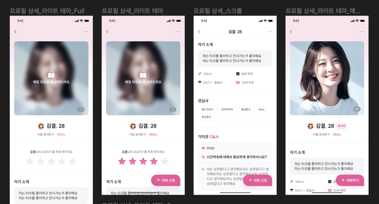
보이는 사진 외에도 각기 다른 형태의 Header를 갖고 있어요. 처음에는 페이지 별로 헤더 컴포넌트를 구성할 계획이였는데, 서비스 규모가 큰 편이여서 관리도 구현도 번거로워 질 것 같았습니다. 여전히 페이지 별로 헤더 컴포넌트를 구성하는 건 똑같지만 반복되는 스타일링을 생략할 수는 있었어요.
Header 재구현해보기
typescript
import { type AnimationProps, type HTMLMotionProps } from 'framer-motion'; import type { PropsWithChildren } from 'react'; import Spacing from '@/components/Spacing'; import { cn } from '@/utils/cn'; import { MotionHeader } from '../Motion'; export default function Header({ children, className, ...rest }: PropsWithChildren<HTMLMotionProps<'header'>> & AnimationProps) { return ( <> <MotionHeader className={cn( `max-width fixed inset-x-0 top-0 z-header mx-auto flex h-14 w-full items-center justify-between bg-white px-5`, className )} {...rest} > {children} </MotionHeader> <Spacing size={56} /> </> ); } function Left({ children, className }: PropsWithChildren<{ className?: string }>) { return <div className={cn('mr-auto flex items-center', className)}>{children}</div>; } function Center({ children, className }: PropsWithChildren<{ className?: string }>) { return <span className={cn('absolute inset-x-0 text-center text-lg font-bold', className)}>{children}</span>; } function Right({ children, className }: PropsWithChildren<{ className?: string }>) { return <div className={cn('ml-auto flex items-center', className)}>{children}</div>; } Header.Left = Left; Header.Center = Center; Header.Right = Right;
Header의 기본 틀 아래에 Left, Center, Right를 children으로 주입해주는 방식이에요. 스타일링도 오버라이딩 할 수 있습니다.
사용하기
typescript
export default function ProfileHeader() { return ( <Header> <Header.Center>내 프로필</Header.Center> <Header.Right> <button> <CloseIcon /> </button> </Header.Right> </Header> ); }
마무리하며
해당 포스트를 작성하고 약 4개월 후, 입사를 하고 실무를 하면서 9월부터 약 3개월동안 다음과 같은 컴포넌트에 Compound Pattern을 실제로 적용했습니다.
- Accordion
- Carousel(Embla Carousel)
- Popover
- Card
- Modal, BottomSheet, Dialog
Compound Pattern을 몇번 적용하면서 느낀 점은 UI 구조가 유동적인 Headless Component에 적용했을 때 높은 재사용성을 가져올 수 있다는 것입니다.
처음 개발할 때는 디자인 시안과 같은 형태 그리고 문제 없이 잘 동작하는 기능 구현에만 초점을 맞췄다면 이제는 변경에 유연하고 추상화 단계와 방법에 대한 깊은 고민을 하면서 컴포넌트를 작성하는 것 같습니다.